Spring 2014
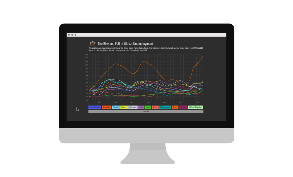
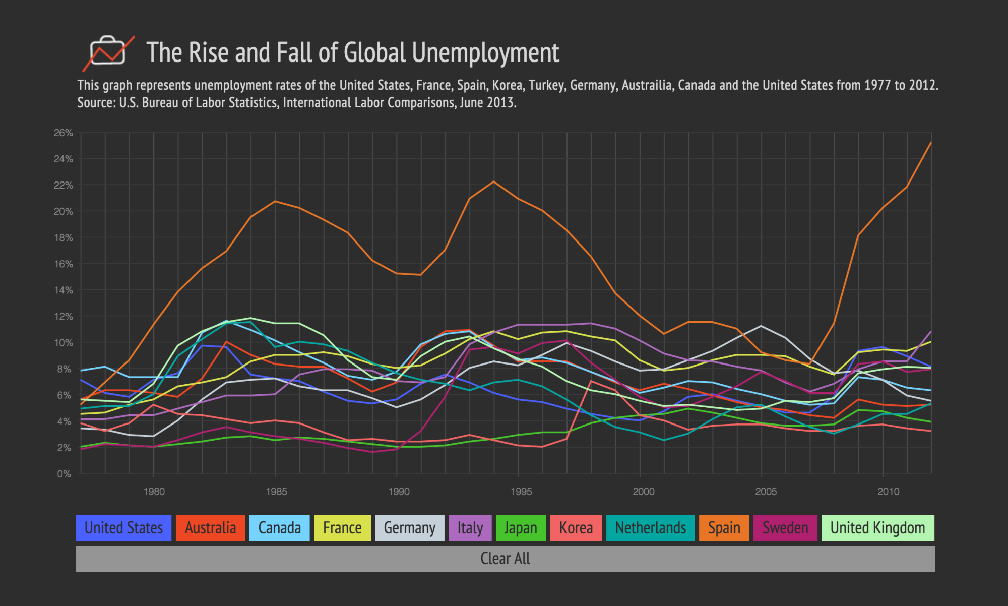
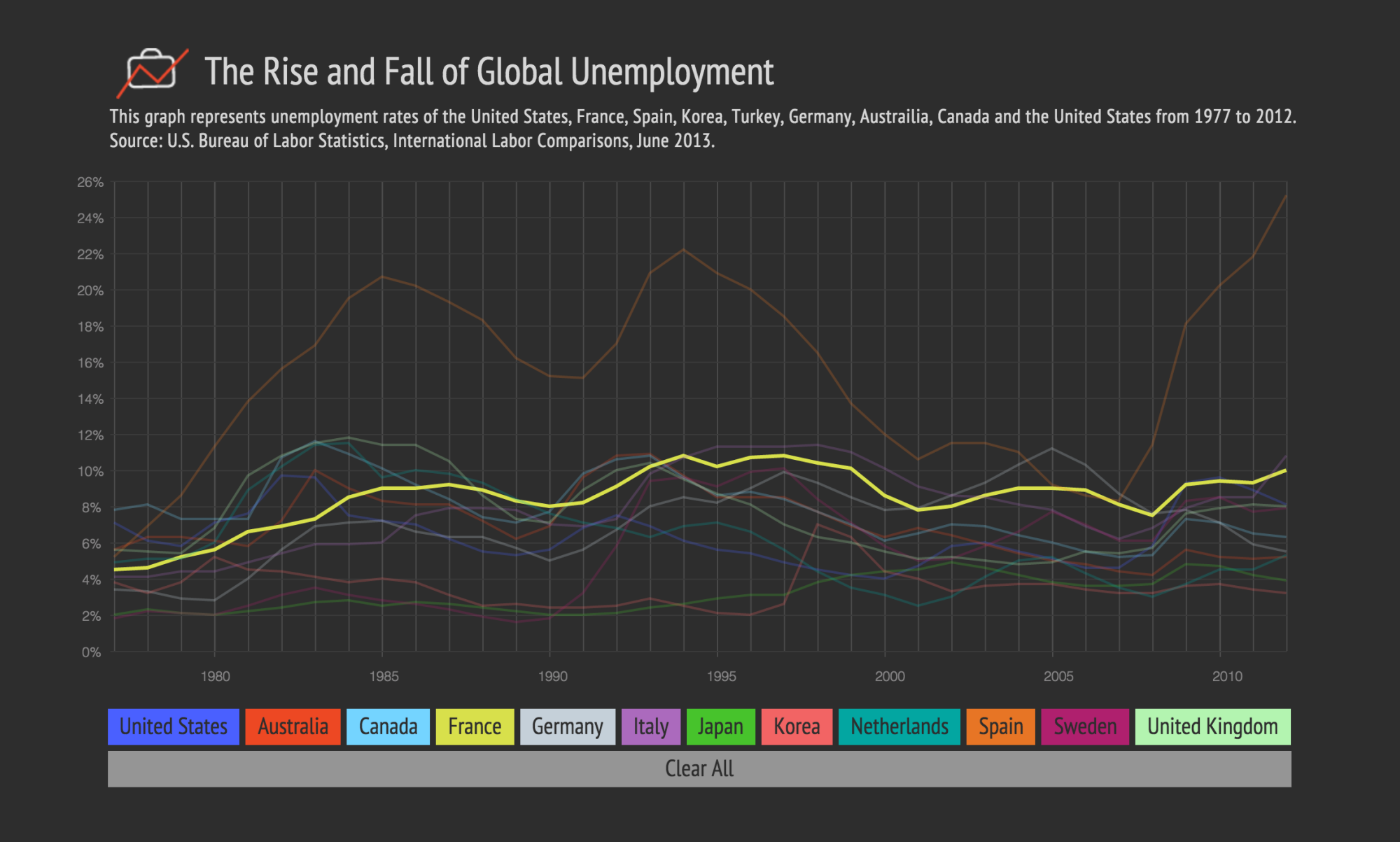
The Rise and Fall of Global Unemployment
This data visualization explores global employment statistics and shows employment trends through time.
Concept
We hear a lot about unemployment these days. It's been the primary focus of every political race since 2008. But how do our current unemployment numbers compare to past unemployment? Or to unemployment numbers of other major countries? This visualization allows users to compare unemployment statistics of twelve major countries from 1970 - 2012.
My Role
I designed and developed the data visualization with HTML, CSS, Javascript, jQuery and D3.js. This project was created for my Data, Design, Code class at Parsons in the Spring of 2014

The Data
The data set consists of International Labor Comparisons from the U. S. Bureau of Labor Statistics and the U. S. Department of Labor. It is very detailed and shows employment data from 1970 to 2012 of the following countries: United States, Australia, Canada, France, Germany, Italy, Japan, Korea, Mexico, the Netherlands, New Zealand, South Africa, Spain, Sweden, Turkey and the United Kingdom. Limited data was collected from a few countries, so they will be excluded from the visualization.
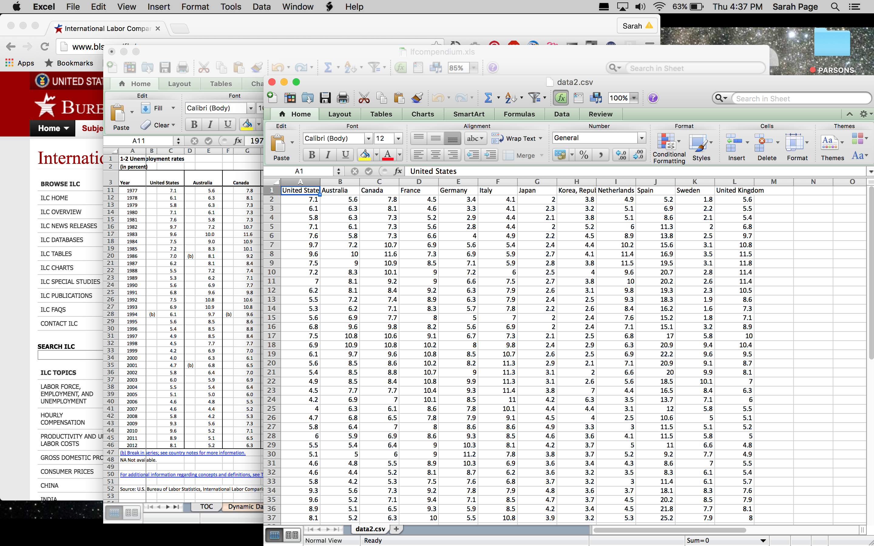
The data set also includes employment statistics divided by different sectors of the economy (agriculture, industry, manufacturing, and services), as well as unemployment statistics divided by age group and gender. The excel file is very clear and easy to understand.
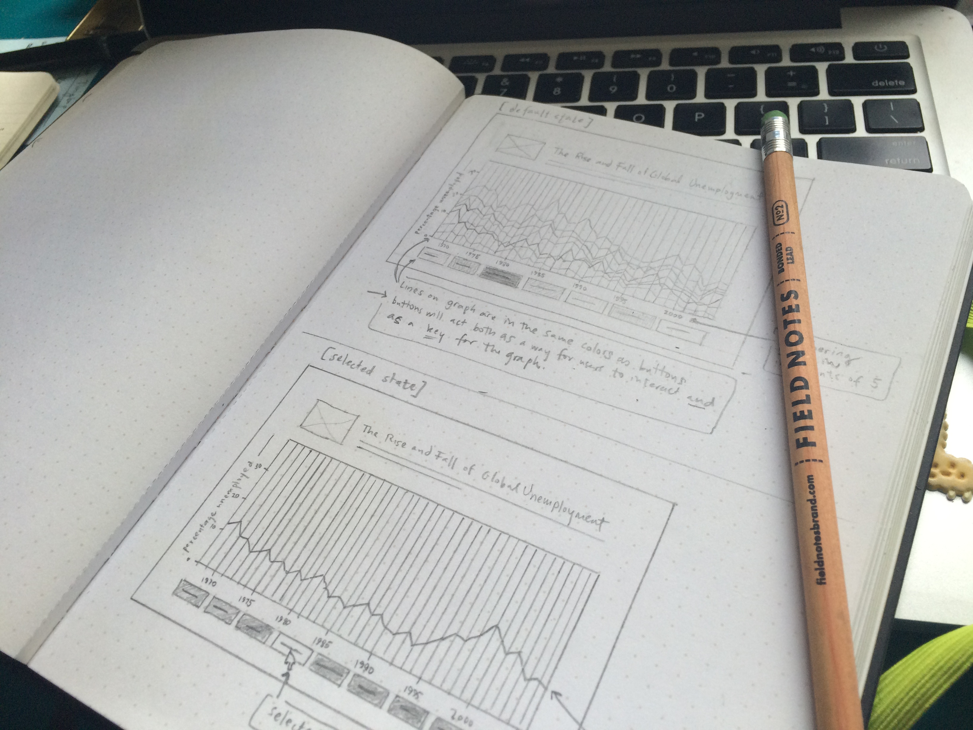
Interactive Elements
I added some interactive functionality so users can compare data from two or more different countries. Users can click on a country's name to toggle the corresponding line graph of each country on and off. I wanted users to be able to still see the other country's lines even if they weren't selected, so I added an opacity to the other lines when one was selected so they were still visible, but less prominent.
Further Iterations
In further iterations, I would like to give the user the ability to compare more nuanced data about each country. The data visualization I made only shows the percentage of unemployment for each country in a given year between 1977 and 2012. However, the data set that I was working with has also broken this unemployment data into unemployment rates by gender, unemployment rates by industry, and unemployment rates by age. It would be very interesting to see how these additional data sets stack up against each other as well.
I'd also like to allow the user to explore each data point a bit more. I would add a tooltip to each data point that shows the year and the exact percentage unemployed for that year. It might also be interesting to see the gender, age, and industry breakdowns as well in this tooltip.
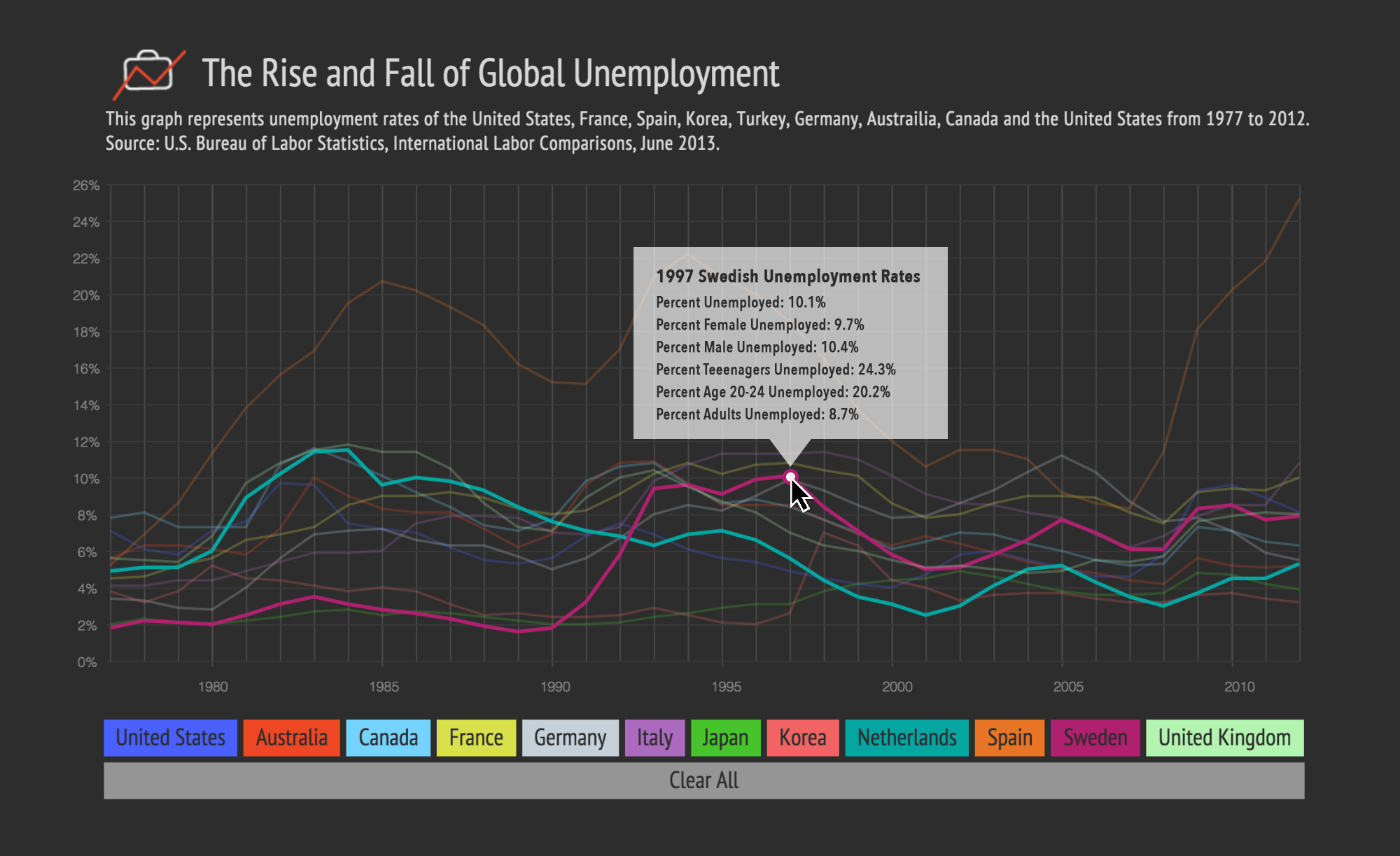
It might also help to show some benchmarks on the graph. For instance, it might be useful to show the global average for unemployment for each year. I would also like to highlight different events that may have contributed to shifts in unemployment numbers.