Spring 2015
Hidden NYC
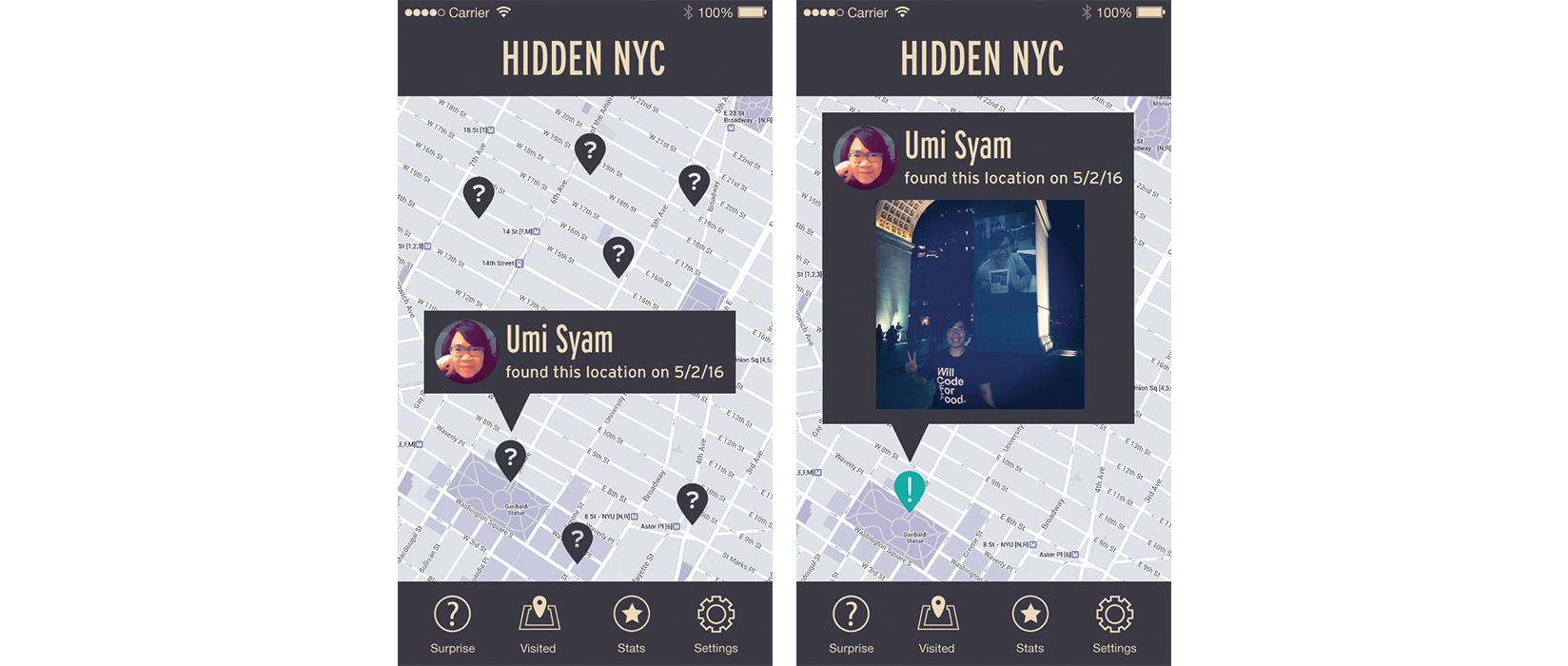
Hidden NYC is an interactive iPhone application that reveals hidden facts about New York as users walk through it.
How It Works
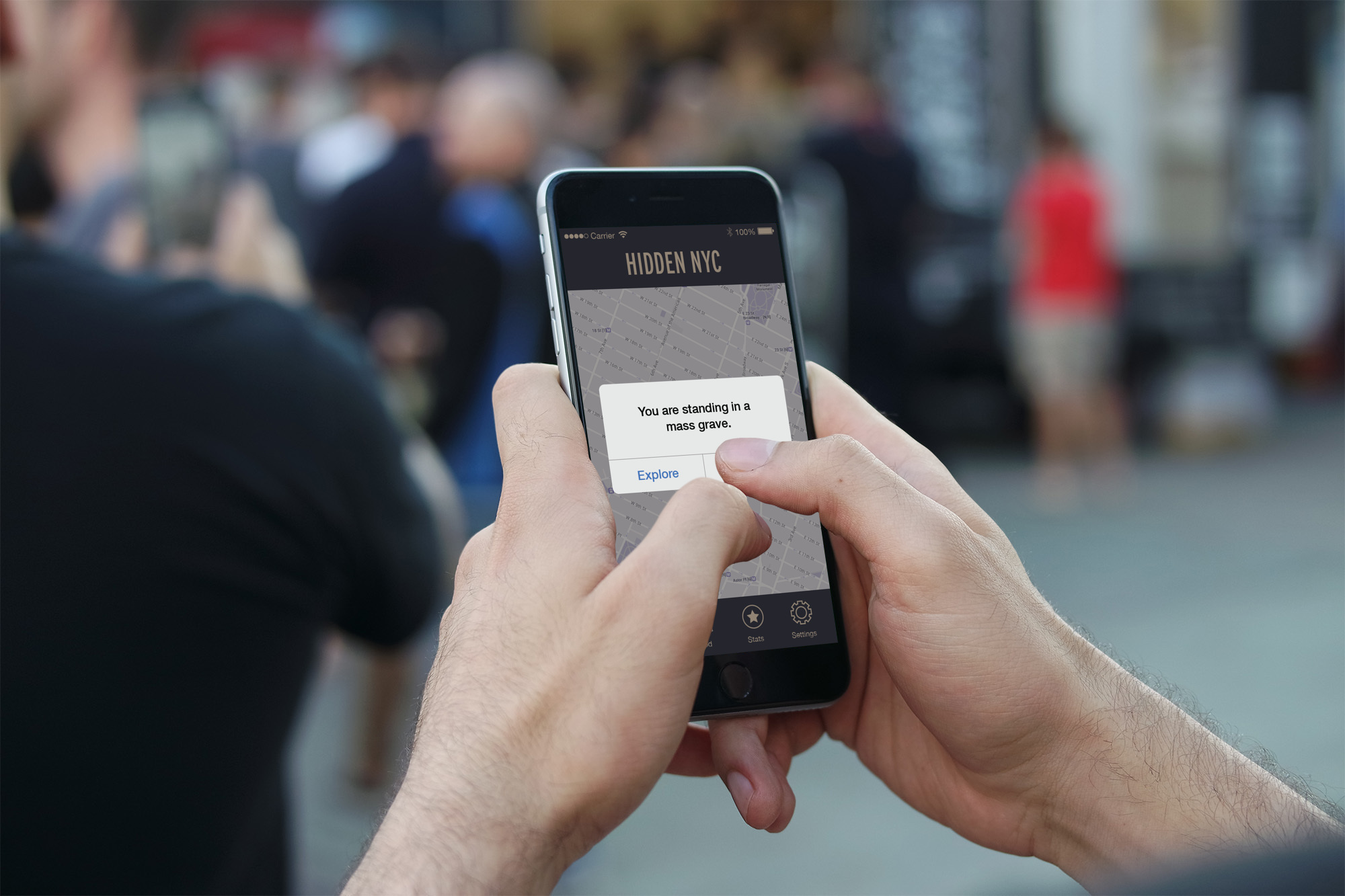
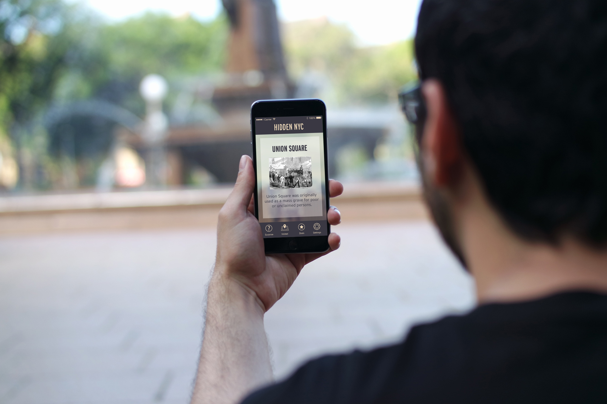
Hidden NYC works like a scavenger hunt. As users walk through the city, they are alerted of a nearby hidden fact about the city and asked to proceed to a specified location. When users physically reach the specified location, a secret about that location’s history is revealed to them along with images of what that location looked like in the past.


My Role
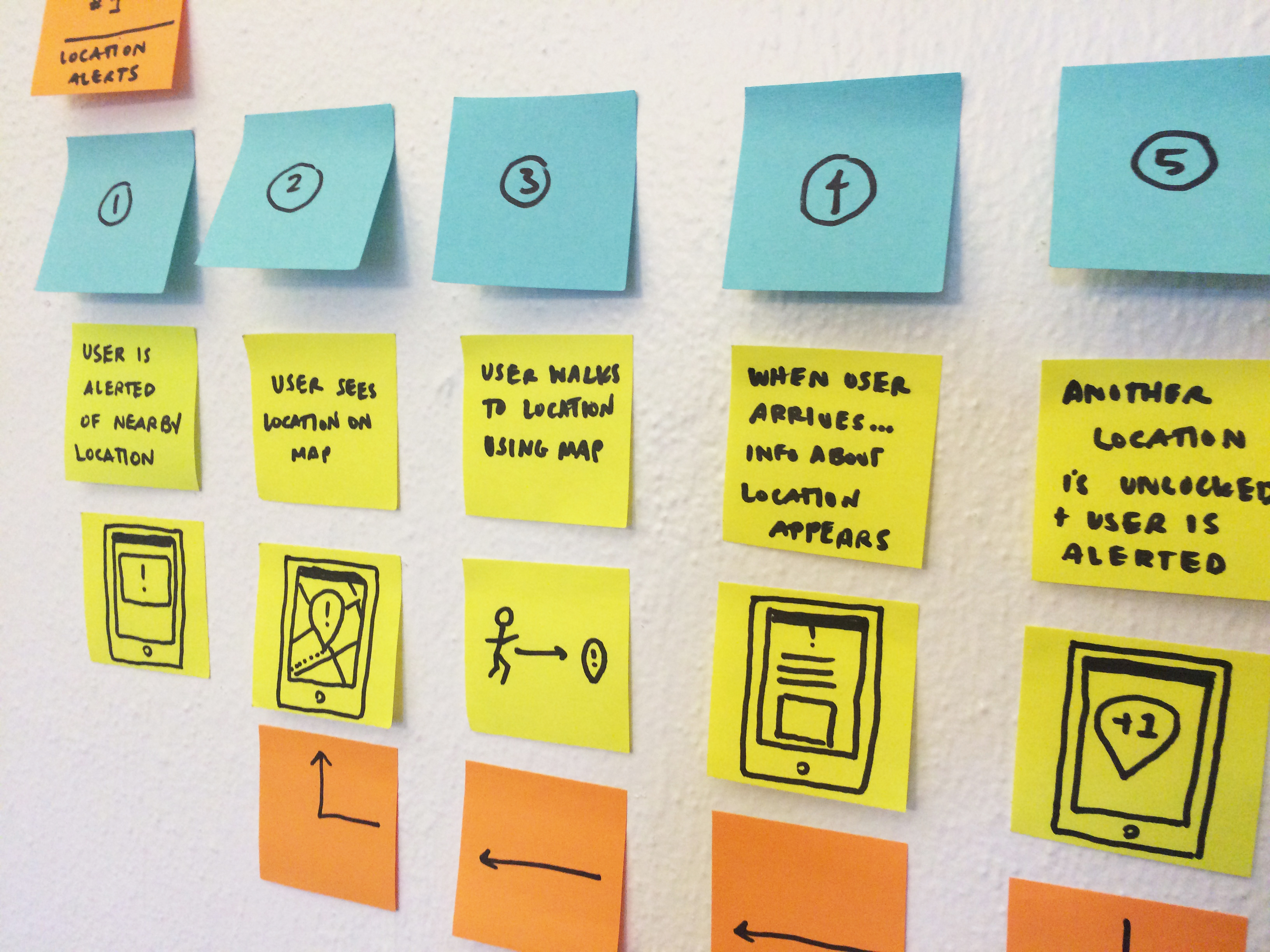
I both designed and developed the mobile application for my Major Studio II course at Parsons School of Design. Once I mapped out the user’s experience using personas, user journeys and wireframes, I began researching and gathering content about New York City history for the application. I then developed the application in HTML, CSS, and Javascript and used Apache Cordova to translate it into a native iOS application.
Insights
Users don’t seem to explore new places on their own
Interrupting users in their daily routines also resulted in people visiting the same places again and again. Over time, the user will exhaust all of the app’s locations that are on their daily route and this would lead to users to quickly lose interest in the app instead of continuing to explore outside of the places that they regularly visit.

Users frequently miss or ignore notifications
I had initially intended that the app interrupt the user’s daily routine with facts about where they were. However, in practice, users often missed the notifications from the app and didn’t end up seeing them until later on, when they were far from the specified location.

Solutions
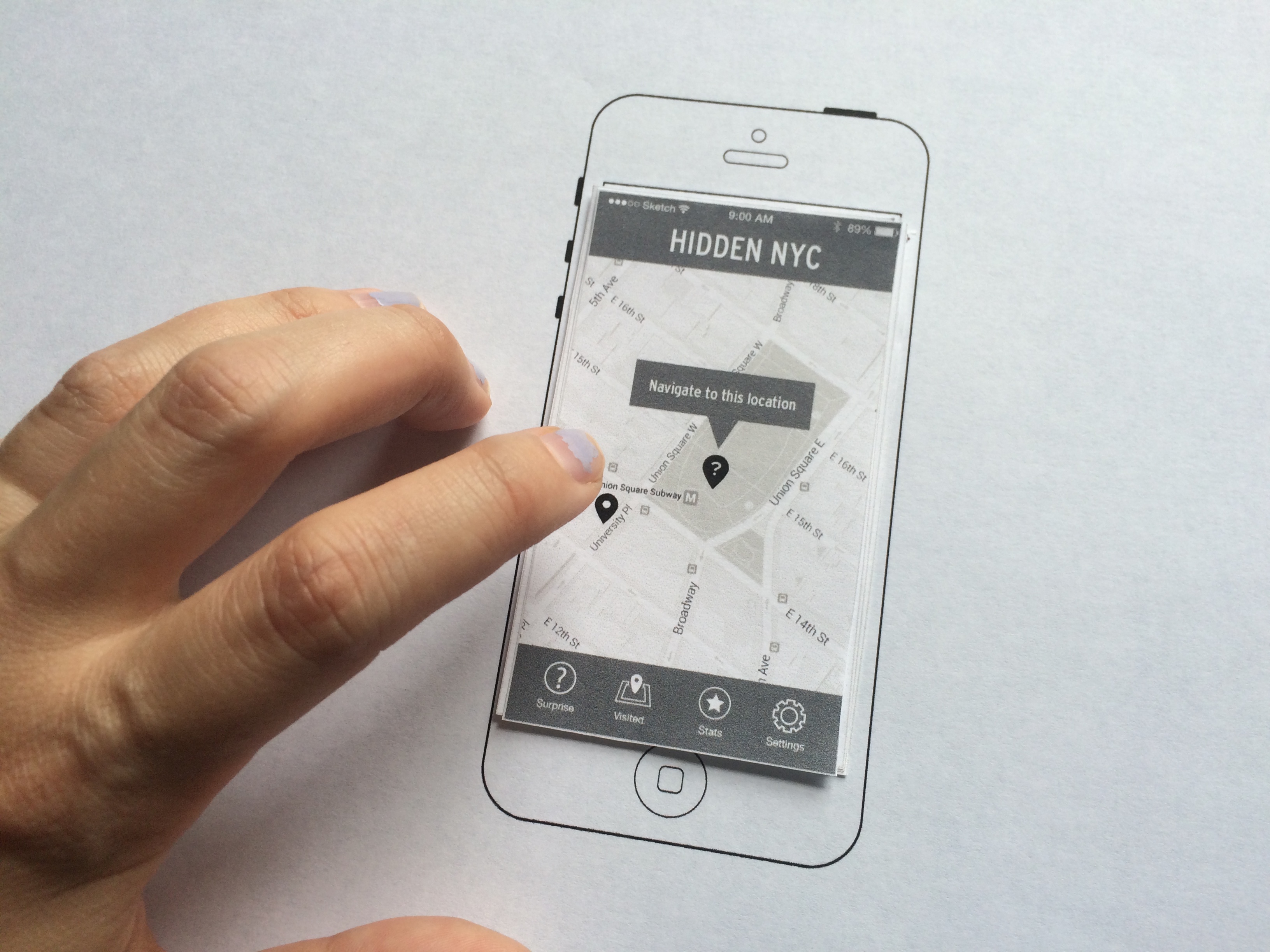
To solve these problems, I decided to structure the app like a scavenger hunt. Instead of having the app send the user notifications along their daily route, the user would elect to play. After opening the app, the user is shown a map with a nearby location and asked to move to that location.
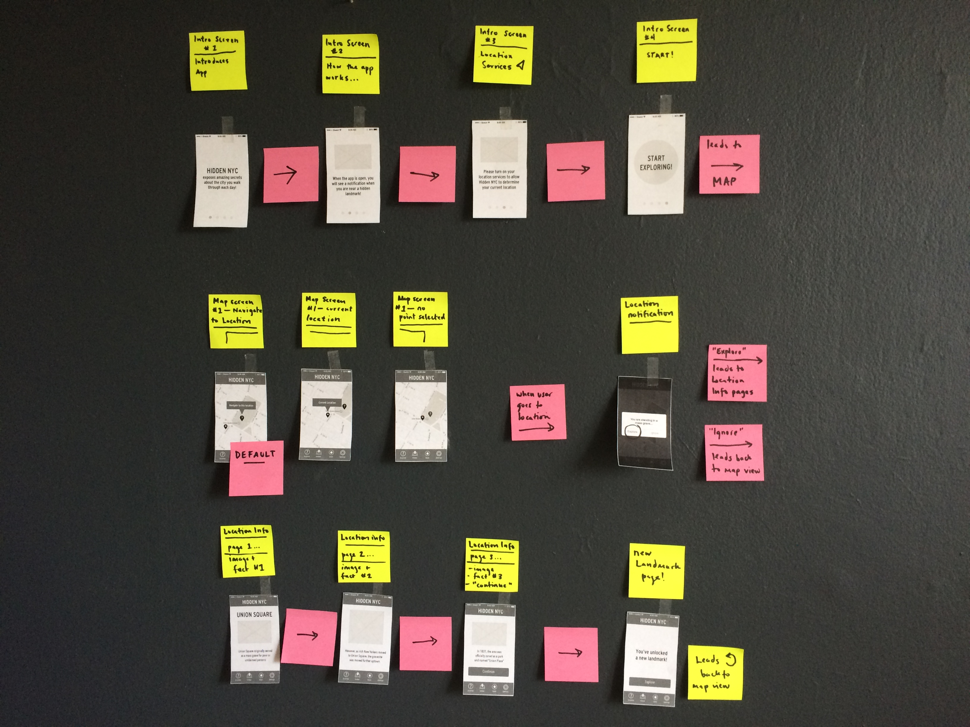
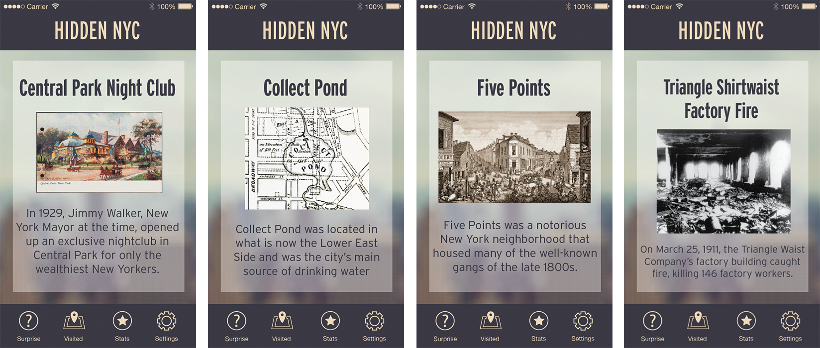
Once the user moves to that location and the app detects them there, a notification will appear with a startling fact about the place. The user will then have the option to “explore” which will allow them to see text and images highlighting the history of that location. This both encouraged users to actually use the application more and to explore new areas of the city that weren’t necessarily familiar to them.
Future Iterations
I’m also currently working on adding additional functionality that would allow users to share their experiences at each location through Twitter or Instagram. I don’t want the information that users share to give away the locations that they’re visiting before their friends visit, so I’d like to simply show that a friend visited a location before the user has visited, and only after the user has visited themselves would he or she actually see the information being shared.
